A logo refresh isn’t about reinventing who you are – it’s about sharpening how you’re perceived.
When brands grow, evolve, or enter new markets, their visual identity often lags behind. A refresh bridges that gap. It keeps the soul of your brand intact while giving it a cleaner, more contemporary presence that speaks the language of today’s audiences.
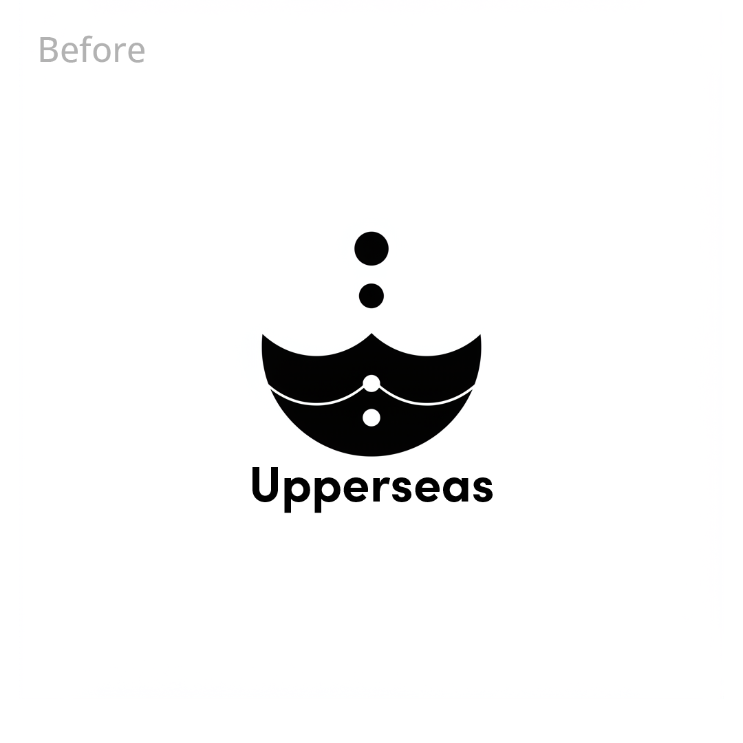
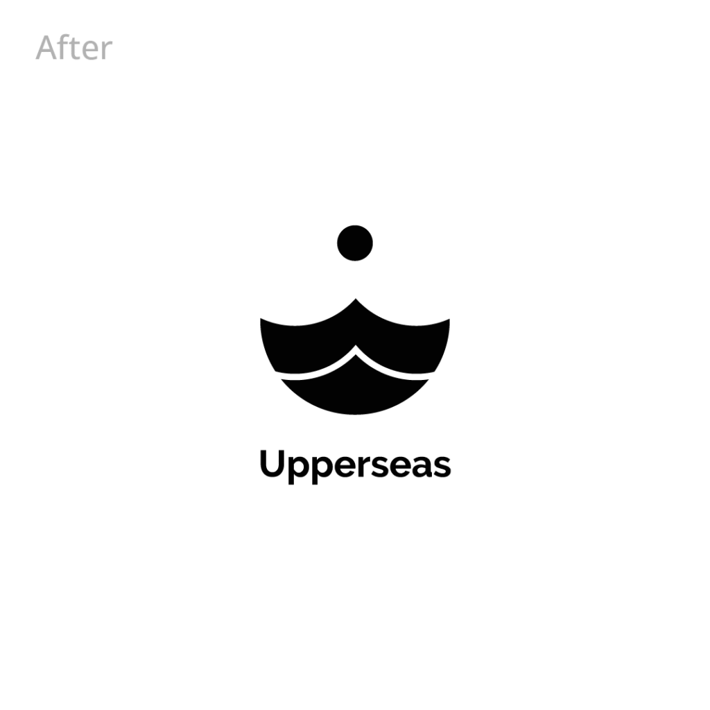
Our process begins with understanding what must stay – the recognizable core that customers already trust. Then, We refine everything around it: simplifying shapes, improving readability, balancing proportions, and modernizing colors and motion so the logo becomes more versatile across digital touchpoints.
The outcome is a logo that feels new without feeling unfamiliar. A fresh face, but still unmistakably you.
Did you know?
Brands that perform a light logo refresh every 5-7 years maintain higher audience recall and appear more innovative than brands that keep the same logo for decades. The secret is in subtle evolution, not dramatic reinvention.
A logo refresh elevates your brand’s existing identity into a sharper, cleaner, more future-ready version of itself – without breaking the recognition you’ve already earned. Perfect for brands stepping into a new stage of growth.